Judging a Book by its Cover
Continual Learning as an Author
Welcome to Polymathic Being, a place to explore counterintuitive insights across multiple domains. These essays take common topics and investigate them from different perspectives and disciplines to come up with unique insights and solutions.
Today's topic provides an example of real-time analysis, adjustment, and adaptation specifically regarding my debut novel. As much as I talk on these topics of adaptability and change, it still isn’t easy. I hope that sharing my experience can help others.
Introduction
We’ve probably all heard the English idiom “Don’t judge a book by its cover.” It’s a fair point and it’s certainly true. I can tell you from personal experience as an author and avid reader that what’s between the covers is crucial.
But we have to be honest. The cover really matters.
So much so that I recently took the somewhat drastic action of redesigning the cover of my novel Paradox. I also learned some incredible lessons on design and feedback along the way that can be applied anywhere.
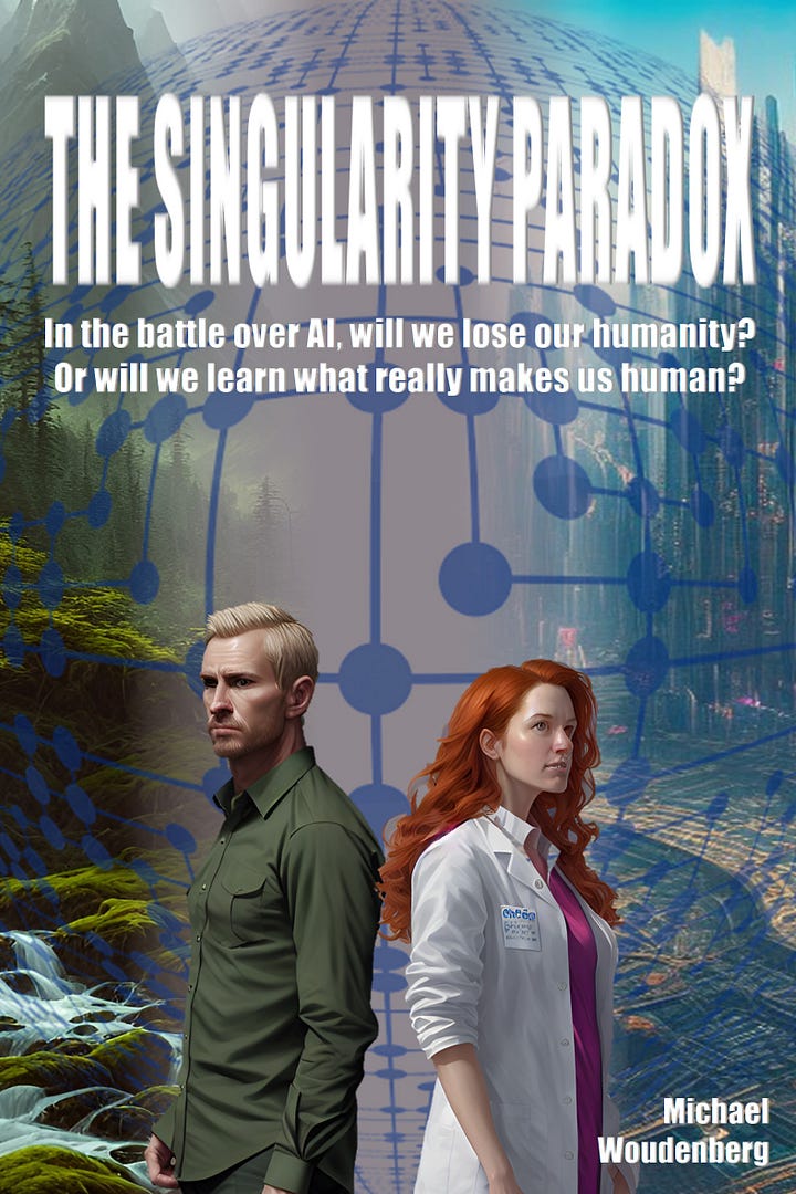
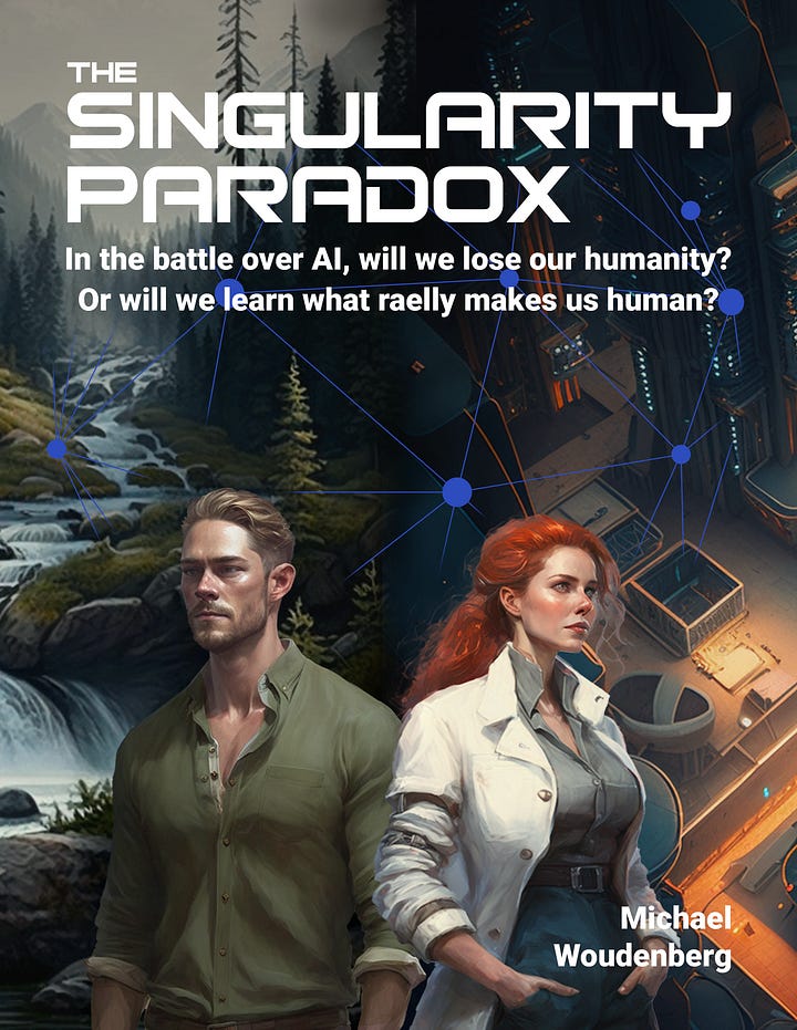
My good friend Matt Madonna and I worked extensively on the original cover for Paradox. I’m not an artist and Matt is just getting established in the field professionally. Our first challenge was just getting trained on the latest tools and techniques and adapting to the emerging AI enablers that were quickly deploying.
The cover I envisioned was intended to capture the tension between the two main protagonists. Kira wanted to move forward in advancing AI to animate the memories they’d uploaded from their mother before she died and Noah wanted to step back and return to a more natural existence. We went through a variety of iterations as I first put my thoughts into prototypes, and Matt stepped in and started using the more advanced tools.


I ran these concepts by friends, family, and colleagues on different forums. We continued to evolve the cover while the manuscript was in editing and settled on the final design shortly before publication.
The feedback was good and it does capture the core foundation of the Paradox between Kira and Noah very well. I really like the cover.
Yet the sales never materialized the way I hoped. I couldn’t quite pin down the problem as I’d often ask about the cover when doing promotions and kept getting solid reviews. The data from the advertisements I was running were showing a different story, however.
When I ran some of my promotional material graphics in ad campaigns, I’d get a very solid number of ‘clicks’ bringing potential buyers to the book on Amazon. Yet I was getting very few conversions to sales. They were getting to the store but weren’t buying.
There were little threads of feedback that would pop out here or there. Like a passing comment at a book fair of “Oh, I thought it was romance at first.” or, when explaining the theme of AI, “That should be on the cover.” I also couldn’t shake the feeling when after several months of having the book front and center in my own living spaces, it wasn’t 'grabbing me.’
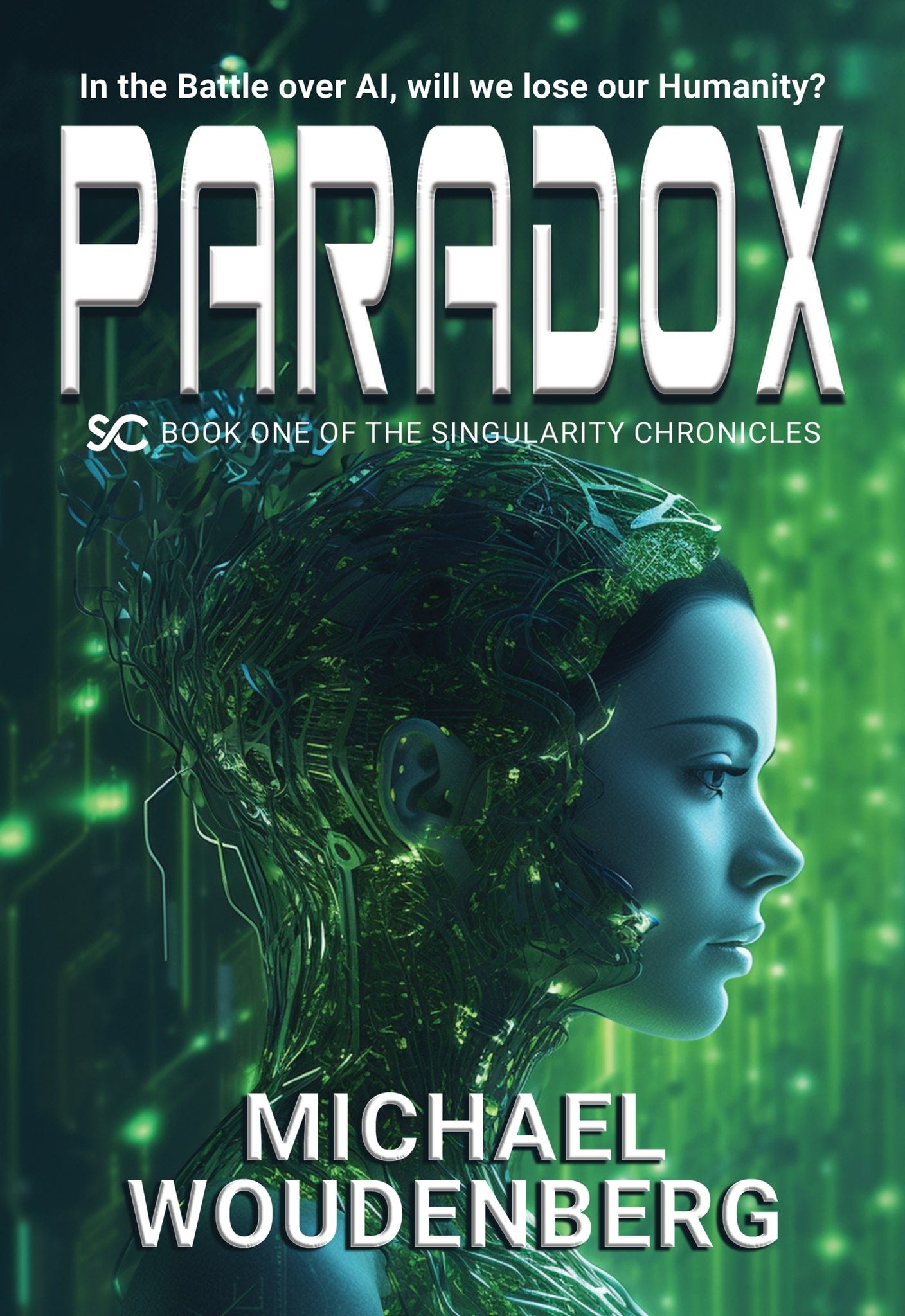
So I went back to Matt and asked him if he had any recommendations. He pulled up an image we used for promotional material which I call “Green Girl.” She’s the image that resulted in the most click-throughs from ads and so I had a quantified impact of this image.
What was wonderful is that this image ended up being substantially easier to integrate than the original cover because it was a single image whereas originally it was a fusion of four images. Thus birthed version 2 of the book cover:
As you may have noticed, I also added a tagline above the title. This is because, on the sales websites, you only get to see the cover. I need them to hit the site, quickly get the gist, and then take the time to read the synopsis and the reviews.
What was interesting about the new design is the feedback was overwhelmingly positive. While people liked the original cover, they really liked this cover. The hard part is I still don’t know how I would have found that out earlier because I’d never considered using an image like Green Girl for the cover I envisioned. I suppose the lesson learned here is to let others visualize the idea in their head vs. relying only on my own concept.
What was the most interesting was the feedback that people felt the first cover looked too AI generated and the second one looked more professional. The irony is that the first one is mostly human-generated whereas the updated cover leverages AI image generators more as Matt pulled the final design together.
The use of AI-generated art has been a delicate point for a lot of people this year. As I covered previously in Did AI Write This Book? AI is a useful tool, it can come up with great ideas, but it can’t replace the humans. This cover is a case in point. Matt has put in a lot of great work and these generators aren’t much different than the tools he’d have used four years ago to put together similar animated material. The difference is that it’s faster and easier today.
Matt and I also took the stance of using only material from licensed sources to help alleviate the concerns. AI ends up being a helpful tool but it still requires two artistic humans to have an idea, create it, and then complete it.
Summary
We do judge books by their cover. We might not like the implications but it does matter. It matters so much that I actually wrote this experience in Book Two of The Singularity Chronicles. This book follows the AI and deals with the wicked problem of what to do with things like gender, race, and bodily experiences when you are uploaded into an AI with no physical body.
In a fun dialog between Kira and another AI, I weave in the story of Paradox’s book cover. It’s a little Easter Egg using reality, about the first book, to make a point about human psychology.
The cover does matter and sometimes you don’t know what right looks like at the beginning. You have to use real-time analysis, adjustment, and adaptation to continue to improve the product. This is the same whether designing technology, a new service, a cutting-edge innovation, or a book about AI and what it means to be human.
I hope this little story helps you improve your own areas of work as we continue to learn and grow.
If you haven’t gotten a copy of Paradox yet, you can find it here:
You can also Preorder Book Two: Integration here:
Here’s a fun video trailer in the meantime.
I also have to brag a bit with this fantastic review a reader submitted. In full disclosure, I have no idea who this was!
Enjoyed this post? Hit the ❤️ button above or below because it helps more people discover Substacks like this one and that’s a great thing. Also please share here or in your network to help us grow.
Polymathic Being is a reader-supported publication. To receive new posts and support my work, consider becoming a free or paid subscriber.
Further Reading from Authors I Appreciate
I highly recommend the following Substacks for their great content and complementary explorations of topics that Polymathic Being shares.
Goatfury Writes All-around great daily essays
Never Stop Learning Insightful Life Tips and Tricks
Cyborgs Writing Highly useful insights into using AI for writing
One Useful Thing Practical AI
Educating AI Integrating AI into education
Mostly Harmless IdeasComputer Science for Everyone


I always appreciate little peeks behind the curtain. Few folks would think a cover and its art (and the words, to boot!) would be so important, but this lays bare exactly why that first appearance matters so much.
Great prom8otion video Michael. The one thorny issue with the possibilities and probabilities with AI integration is the defacto origin of the tech. Fear mongering that it's too dangerous for the masses to figure out and implement, therefore the usual suspects get control and the vast wealth, they will squander. It's now so blatantly obvious now, the script is always the same. Just thinking back to Y2K, it should ring some bells.